Photography by Kristoffer Paulsen
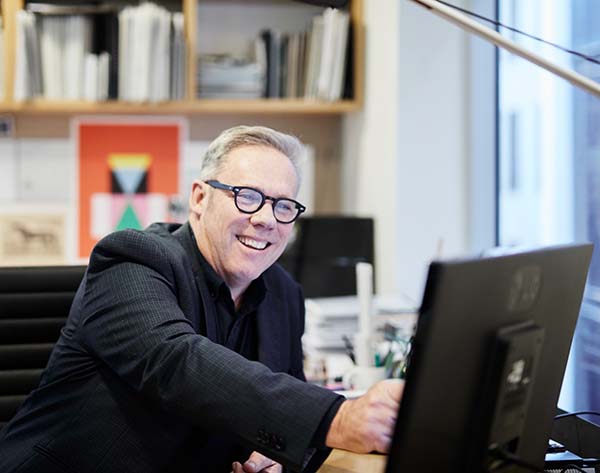
Roger Nelson, Director of NH Architecture, shares his thoughts on good design principles, the Living Building Challenge and how they influenced the design of Burwood Brickworks.
What is good design?
Everyone has objectives about context and community, but the crude test is if it really feels connected when it’s built. Our quest is always to bring deeply ingrained design capability to each site and make buildings context-specific. To look at the actual site and think about orientation, what advantages you can get from facing certain directions, getting certain outlooks and the true aspects of making it a nice place.
That sounds really basic, but it’s about, every person’s view and what makes them feel better. It’s celebrated in domestic architecture, so why can’t that be true in the commercial world? The skill comes from balancing commercial arrangements – those to do with authorities and so on – and the reality of actual life and what we value as human beings. We’re trying to make a very strong link between the intention of the functional planning and how the site is organized, how the site’s organized and the actual true living experience of our geography, climate, context and indeed social and anthropological aspects.
How much of the design thinking was shaped by the Living Building Challenge (LBC)?
We have done a lot of work for Frasers Property with Peri Macdonald and his team and developed quite a strong relationship. One project that preceded this was a little centre called Second Ponds in Sydney that won sustainability prizes. That’s when a different paradigm started to emerge in the neighbourhood shopping centre space. For example, it had PV cells on the roof and there was lots more natural ventilation. It was very local scale, but Peri’s and Frasers Property’s attitude enabled us to think about things that were otherwise not typically done with neighbourhood centres at that time.
In 2014 we started looking at the Burwood site. We’d done a lot of development plan work for it so we were knowledgeable about the site. The early layout and planning is pretty much how the centre has ended up. We were trying to bring forward the attitude of how a neighbourhood shopping centre could be, which is fundamentally not a mini version of a regional shopping centre. It was to be much more connected, much more open and much more engaging with the green space around it. In other words, all the basics of design that you should probably be paying attention to regardless of the articulated objectives of the LBC, but it really added another impetus to the ideas of good design.
Photography by Dianna Snape courtesy Frasers Property
Why do you think the regenerative design practices exhibited in Burwood Brickworks are important?
These ideas are not new. Since humans have been organizing themselves into settlements these things [have been] ingrained into our being. Some of us have lost a little bit of that, especially as a country like Australia becomes one of the most urbanized countries in the world. To live in urban areas healthily, one needs to pay attention to the basic tenets of human existence. Responding to local climate and prioritising wellbeing in ways that are very simple but compelling is obviously what you do.
I grew up at a time where even in our architecture school in WA, we didn’t have air conditioning in any of the buildings, and in a house air conditioning was a luxury. So we needed to understand those things, were taught them and be trained to think about them. There was a deep-rooted attitude towards layout, design and orientation because that’s where it all starts.
In your experience, what is one of the biggest misconceptions of the Living Building Challenge?
There can be a bit of ‘Little Britain’ syndrome where the guy walks around and says, “I want one of them. I want that one or that one.” There’s Burwood Brickworks, “we’ll have one of them”. But you don’t buy it, you have to make it. This is made specifically for this site with various careers’ worth of knowledge and intellectual property that’s built up over time. It’s not a flash in the pan. This is a testimony to everybody’s input and not one of us could have done it without the other.
One of the damaging aspects is to think that one solution can be applied everywhere. Every place and part of our nation: country, urban areas, suburban areas and rural areas has particular characteristics, as does its community. Australia is a big continent and one solution in Brisbane cannot necessarily apply to Hobart.
If we want another Burwood Brickworks, we have to think about what we would take from it. We would strip it back to the fundamental things that are embedded in that project that could be applied to any project as a principle, idea, concept, way of thinking, or value like light, air, and orientation.
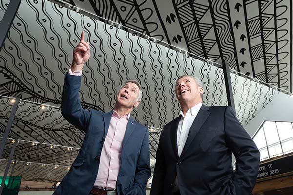
Image courtesy Frasers Property
Can you talk us through one of your favourite parts of the Burwood Brickworks’ design?
Being able to have a client happily accept a sawtooth roof with opening windows in it, and then subsequently, the Indigenous artwork on the ceiling wasn’t that hard to get across the line. But 10 years ago, I would have been laughed out of the room.
To be able to have that sawtooth roof is amazing because now it’s celebrated as one of the loveliest spaces in that building. It lets all that light in, lets all the air in when it needs to, it’s got amazing artwork on the ceiling which is all-consuming, and it will let you see the hydroponic greenhouse and Acre farm on the roof.
It’s a very open and democratic way of planning a building, and yet it’s relatively simple. The factory that would have been there when they made bricks would have had a sawtooth roof. In that way, it was an easy link back to its previous role as a brickworks. And then of course the Indigenous artwork celebrates a deep understanding of geography and geology of the area: from the Dandenong ranges to Port Phillip Bay. Suburbia can be seen as endless and anonymous but this is giving Burwood Brickworks character and personality that really makes a place.
Why is it important for established firms such as NH Architecture to take on a project like Burwood Brickworks?
We have a voice in the industry and we’ve got a reputation for dealing with complex urban buildings, masterplans and thinking. A project like this needs to be used as a provocation for people to ask ‘how can we do this?’ rather than ‘should we do it? The property industry is a mixed bag of people who want to innovate and do things. But you’re also dealing with the investment people who are generally worried about risk which I fully appreciate.
Now I find people go to Burwood Brickworks and can see what we’re talking about. Even our major retailers have embraced this. The community thinks there is something better about their store even though they can’t really put their finger on it. It obviously follows that people will be more likely to go there and therefore, it’s a better commercial proposition.
The building has caused people to think about the ‘why not do it’ instead of ‘why do it’. We’re hopefully inspiring a group of people that feel like innovating and feel that urge within their human existence to get beyond where we’re at today, and make our lives healthier more appealing and more healthy in urban environments.
Photography by Kate Shanasy courtesy Frasers Property
What factor does Burwood Brickworks being a retail centre play?
We don’t often think of shopping centres as noble contributions to our built environment. So to say that Burwood Brickworks is ‘the most sustainable shopping centre’, is sort of a plus and a minus in one sentence. I think it’s interesting because it pricks people’s conscience and makes them think that this building typology can be an exemplar of our built environment, and it’s commercial. It’s fundamentally there to exchange.
It’s a hub to accommodate and bring together business and opportunities for exchange that the community is interested in: whether it’s food, groceries, personal wellbeing, interaction with each other. It’s got a transactional element to it but it’s also about uplifting them and providing a forum for human exchange.
The shopping centre is actually one of the most visited places. It has the power to demonstrate that everyday things can be uplifting and restorative: they can restore our sense of wellbeing and can contribute to it. People can be in a place that’s supplying a connection to nature, local geography and history.
Photography by Dianna Snape courtesy Frasers Property
What is the character of Burwood Brickworks?
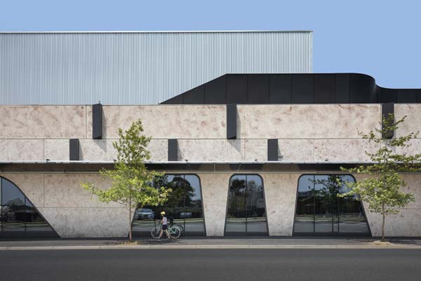
The building is not an ‘in your face’ sort of building. It’s not saying ‘look at me’ as an architectural piece, it’s providing a backdrop for its fundamental activity to be able to be enjoyed.
We’re not trying to force people down some sort of pre-meditated pathway, all shopping centres like to do that, you can only go this way and it can only come this way back. [People] feel that they’re being made to do something that they don’t really want to do.
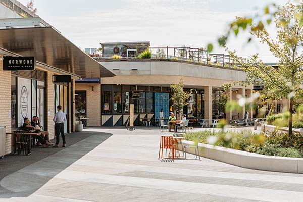
We wanted these public environments to allow visitors to encounter it any way they like. You can be a local resident and walk across the park and just hang out on the veranda bridge; you can go onto the roof and muse over the guys doing the gardening and the quails upstairs… there are so many different ways to encounter the building. I think that’s what’s rich about it.
On the east side it’s got a prominent tree and a recess, and the recess is where you walk in, it’s also a space where you can gather. The North sun will get into those little crevices and people will be able to sit there in the sun, sheltered. And that’s where the people are, and people go to where other people are. It’s just using those tools of well-understood patterns of behaviour and using architecture to support that.
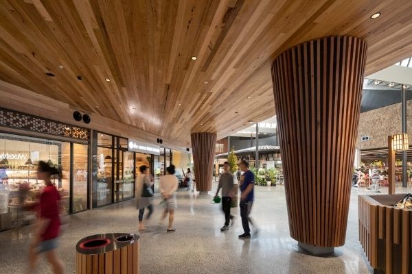
Then there’s the aesthetics of it, which is really a calm backdrop to enable the business of the place, or the enterprise to sort of do its thing and to host it. The recycled timber and concrete floors contribute, they’re not neutral. They’re reinforcing the ethos of the building which is to have a story and a narrative.
The architecture definitely has a role of hosting all of that, and it’s subtle. But it also honestly expresses what it is.
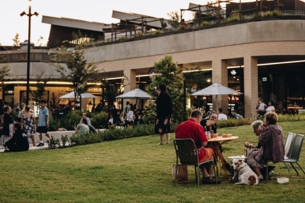
Image courtesy Frasers Property
What has working on a Living Building Challenge project taught you?
There’s been a huge amount of learning – the job for ourselves is to capture that and to reapply it. To take the things that are seen as remarkable and ask if they could just be seen as normal business. We’ve got to get the world to understand, and our development community that invests in these types of things, that these things are fundamental to their existence, they’re not extras.
You’ve got to see it as a holistic network. For too long people have been deciding on what appears to cost something, and not realising what contributes to the end result. They see only the cost side not the benefit side. Value is a word that implies that there’s a cost and a benefit.
It does compel us to think about not doing necessarily everything the same way as we’ve done it before. As someone said to me the other day, analysts view the future by looking at the past, and the future is coming, whether we like it or not, we can’t slow it down. So it’s best to get on board with it. The Living Future [Institute] is exactly that; it’s about how we live in the future.
I would say that the things we’ve done give us a stronger voice to argue for them, and our job is to normalise it and have it seen as everyday practice. This building on its own is only the beginning.
Petal Certified Burwood Brickworks was designed by NH Architecture and developed by Frasers Property. It was awarded The Allan and Beth Coldicutt Award for Sustainable Architecture and commended for interior and commercial architecture in 2021. Congratulations to the NH Architecture team for their work on Burwood Brickworks, and to Roger Nelson who will be retiring at the end of this year on a wonderful career!
Learn more about NH Architecture’s involvement with the project here.

